Improved express checkout transparency

Redesigning express checkout transparency | +7.1% CVR, +8.3% payment completion
Brought in to support the checkout team while they were without a dedicated designer. The brief was simple: CVR is low. The challenge was more interesting than it looked.
Context
The checkout team flagged a conversion problem on mobile and needed design support while they recruited a dedicated designer. I picked it up on top of my existing two product teams, scoped it, identified the friction points, and designed a solution in a short time window.
The starting point: users were reaching the express checkout step and not completing. The question was why.
Problem
Two things were working against each other in the existing layout.
- Price wasn’t visible before the payment decision Users were asked to pay via PayPal or Apple Pay before they could clearly see their final total. At the most critical moment in the journey, the price, the thing that determines whether someone commits was hidden. Users either trusted it blindly or dropped to the longer checkout flow to verify it first.
- The promo code field was in the wrong place for everyone The promo input sat above the express checkout section prominent, always visible. For users without a code, it was a distraction that invited them to leave and go hunting for discounts. For users who had already activated a code via the promo bar or pop-up earlier in the journey, it created a different problem: they couldn’t see their discount was applied, creating doubt right before payment.
External Evidence
Baymard research shows that prominent promo code fields at checkout are a documented cause of abandonment. Users have to search for codes and don’t return. Many e-commerce brands remove the field entirely from express checkout. I wanted to find a more balanced approach.
The core design challenge
The promo code needed to serve two opposite user types simultaneously:
Make it too visible → users without codes leave to find one → abandonment.
Make it too hidden → users with activated codes can’t confirm it’s applied → loss of trust at payment.
Collapsible entry below the total, discoverable for those looking, invisible enough not to prompt those who aren’t.
Hypotheses
Hypotheses 1
Showing the final total price before the payment decision will reduce hesitation and increase express checkout adoption.
Hypotheses 2
Making promo codes discoverable but secondary will serve users who have a code without triggering abandonment in those who don’t.
Solution
Three structural changes to the checkout entry point, each one addressing a specific behavioural risk.
- Total price surfaced above payment options The final order total, including any active discount. Now appears before the express checkout buttons. Users verify first, then commit. This matches the natural mental model: confirm → pay.
- Collapsible promo entry below the total The promo field moved below the total price, inside a collapsed section. Users who have a code or who activated one via the promo bar earlier, can expand it and confirm it’s applied. Users without a code see a clean checkout with no prompt to go looking.
- Clearer purchase hierarchy The redesigned layout establishes a clear flow: Price confirmation → promo (optional) → express payment. This structure reduces cognitive load at the most drop-off-prone step in the funnel.
Before & After
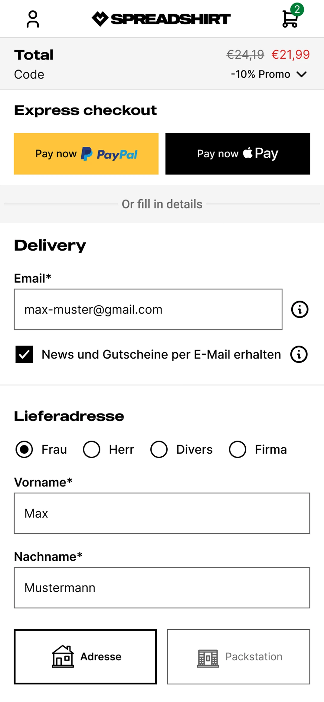
Total Price is missing & Prominent input-field
Prominent promo code fields at checkout are a documented cause of abandonment. 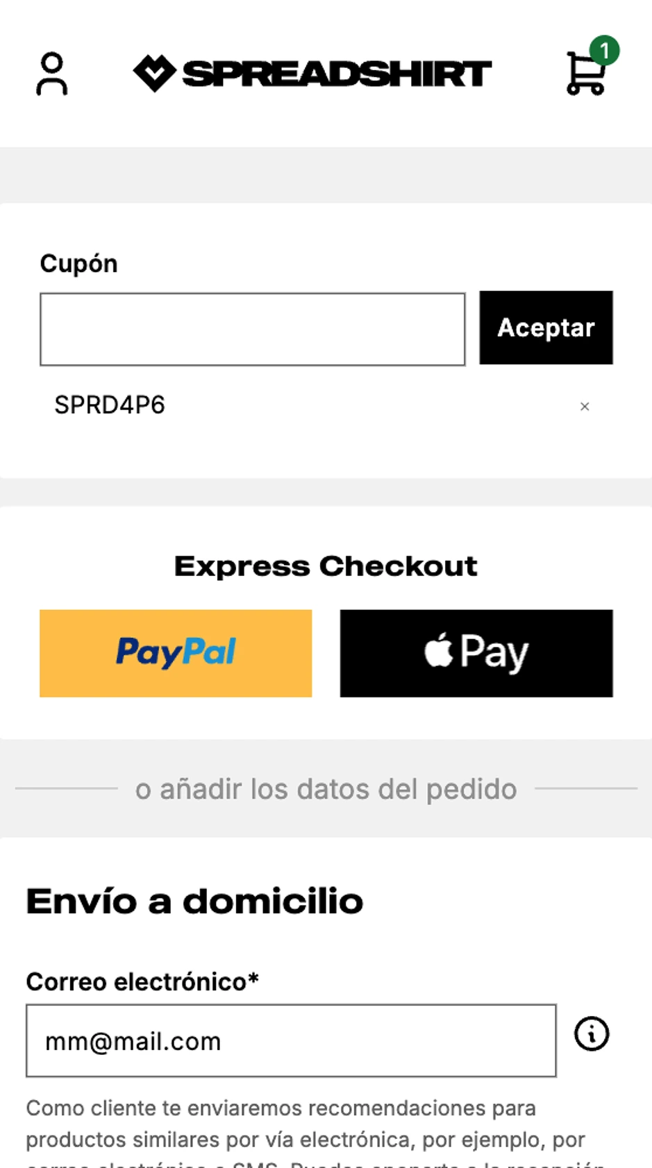
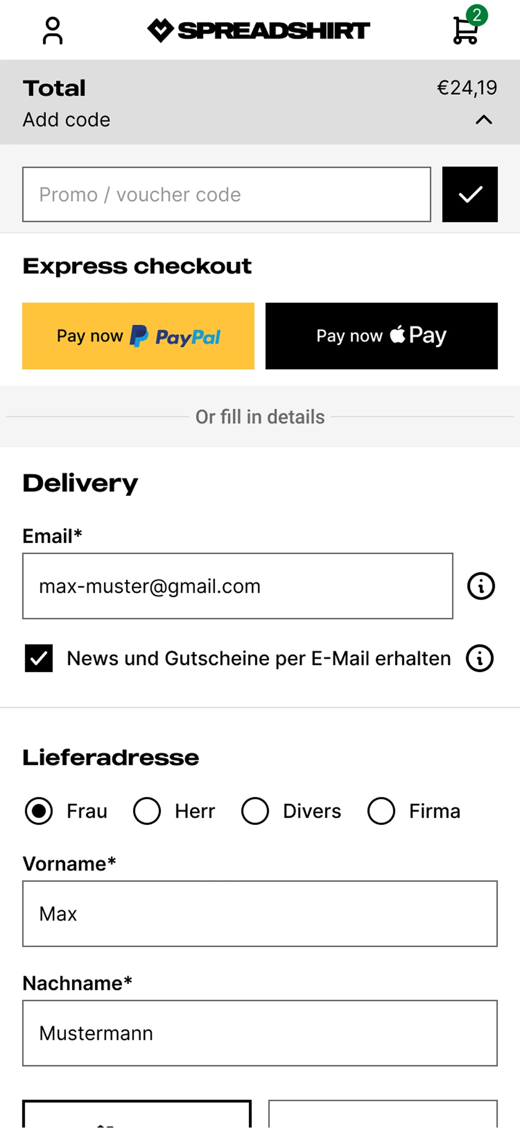
Promo code is not activated
The whole Total + Add code component is clickable and expands to reveal the “Promo / voucher code” input field.
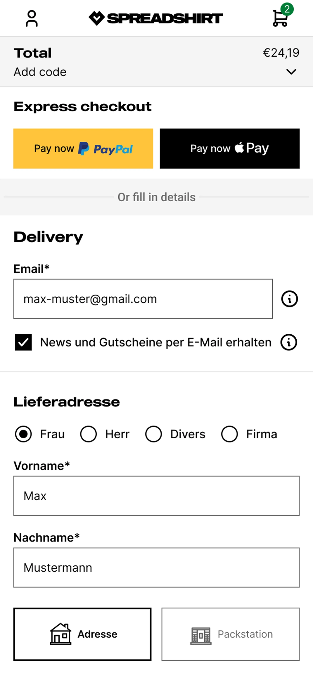
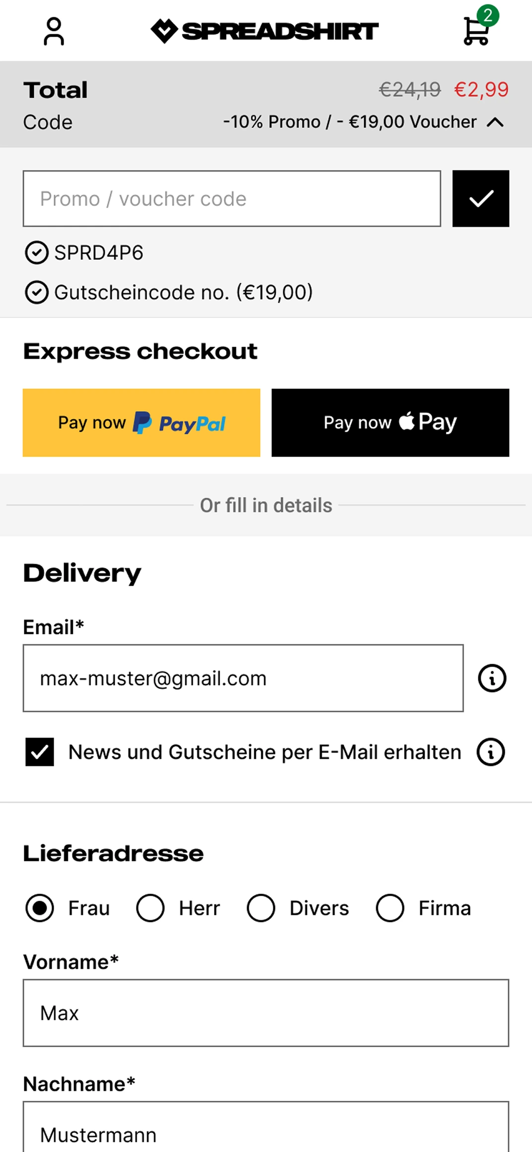
Promo code is activated
Promo-code + Gift voucher
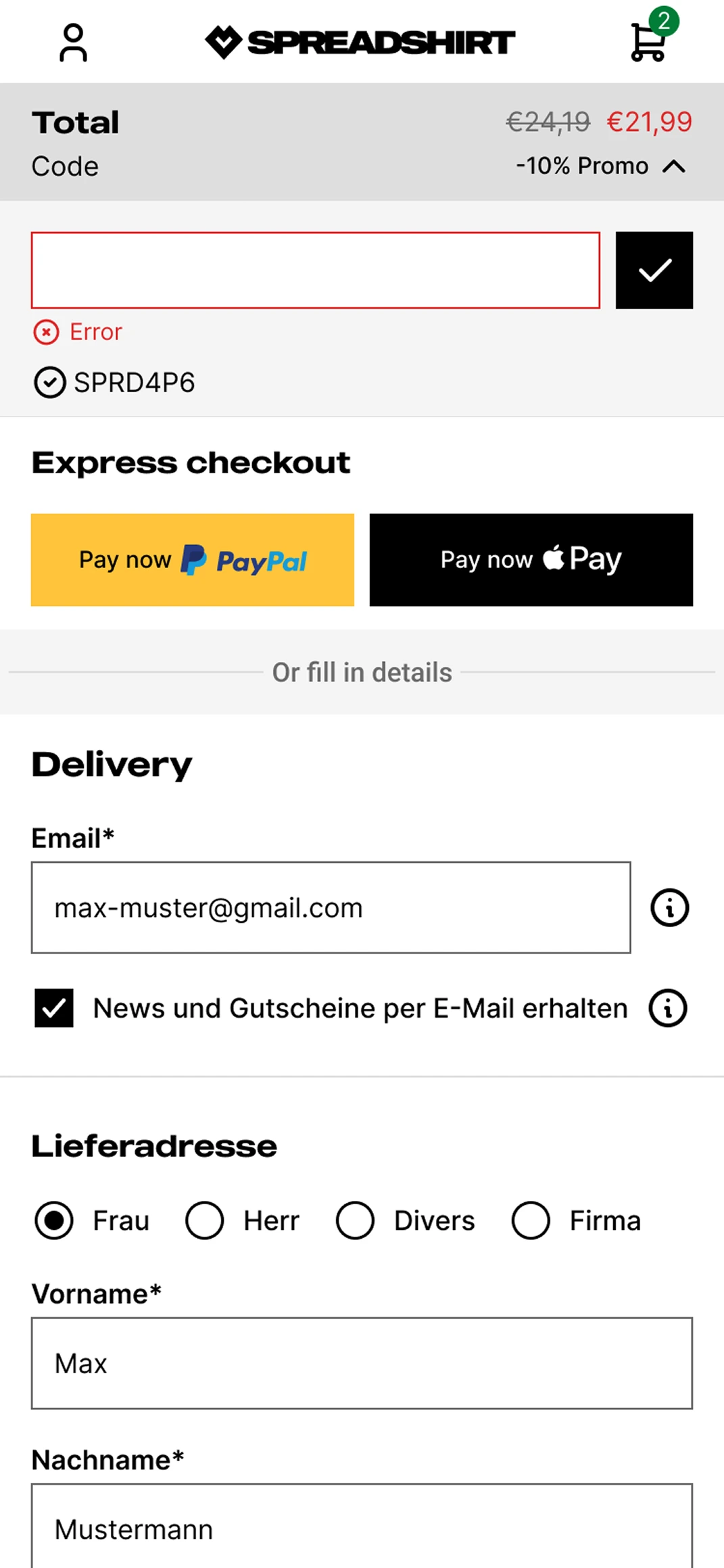
Error state
Results
Post-launch checkout funnel data showed strong improvements in checkout completion, particularly in the payment-to-order stage.
Checkout start → Order
Payment → Order
These shifts suggest that improving transparency at the moment of payment, by surfacing the total price and making promo code access easier to find, contributed to higher user confidence and better checkout completion.
Reflection
The interesting part of this project wasn’t the UI, it was the behavioural tension at the centre of it. The promo code field had to solve two conflicting user needs at exactly the same moment: reassure users who already had a discount, without prompting users who didn’t to go looking for one.
Getting that balance right, visible enough to build trust, subtle enough not to create a distraction; is the kind of decision that doesn’t show up obviously in a before/after screenshot, but shows up clearly in the conversion data.
Speed without transparency creates hesitation.Small UX decisions at critical funnel moments can have outsized business impact.