Redesigning the TeamShirts PLP

Redesigning the TeamShirts PLP | Making a B2B bulk pricing model transparent without changing the business model
Users were consistently surprised by their basket total because the default price shown on the PLP assumed 25 items, a quantity most buyers never reached. The business wouldn’t change the default. The design had to fix the perception problem instead.
Context
TeamShirts is a B2B print-on-demand platform for sports teams, and businesses | bulk orders with volume-based pricing. I was the sole designer on the product. The PLP had accumulated significant UX debt: outdated information hierarchy, accessibility issues, and a pricing mechanic that consistently confused users.
I ran a full Baymard best-practice audit alongside primary research and owned the redesign from discovery to stakeholder approval over three months.
Problem
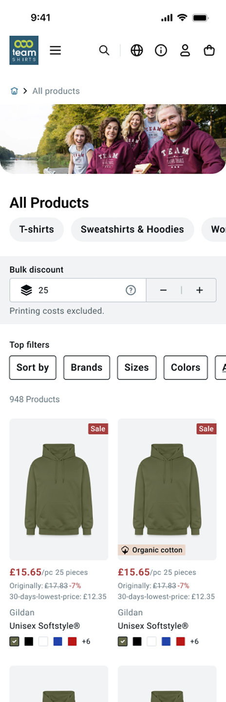
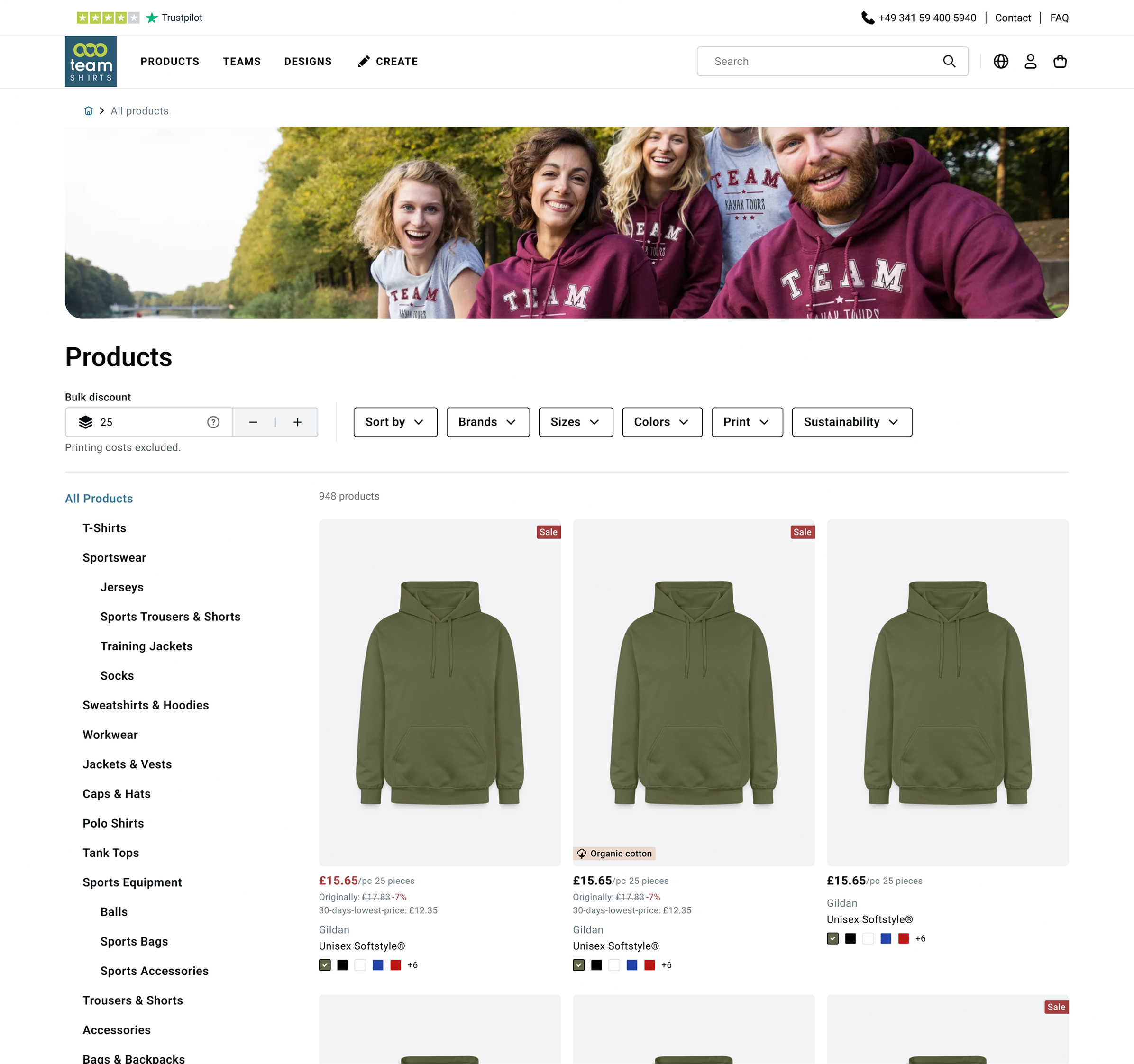
TeamShirts’ pricing is bulk-based, the more items you order, the lower the per-unit cost. The live PLP displayed prices based on a default quantity of 25 items. But the majority of actual basket sizes were between 10 and 15 items, meaning the price users saw on the PLP was almost always lower than what they’d pay at checkout.
This created a predictable and repeated trust problem: users arrived expecting one price and were surprised, negatively at the end of the journey.
Discovery | Research
In interviews, users described the pricing as “not transparent.” In unmoderated tests, especially on mobile, many didn’t notice the 25-item qualifier at all. The surprise came at checkout, often after they’d already invested time building their order.
40+
Unmoderated usability tests
5
User interviews
10–15 items
Avg. actual basket size
The constraint
The logical UX fix was to change the default quantity to 15-item, closer to real basket behaviour. After multiple conversations with the TeamShirts Director, PO, and assortment manager, this wasn’t possible. The 25-item default was tied to the business model and discount structure, and it wasn’t going to change.
The design challenge became: how do you make a pricing model transparent when you can’t change the model itself?
Two approaches | And why one was rejected
Approach 1 | Simplified tier system (Rejected)
Show a simplified discount tier selector on the PLP | users pick their quantity bracket, prices update accordingly. Clean, transparent, and directly addresses the confusion.
Approach 1 | Simplified tier system
Predefined tiers
Based on predefined amounts with clear way of communicating the associated discount.
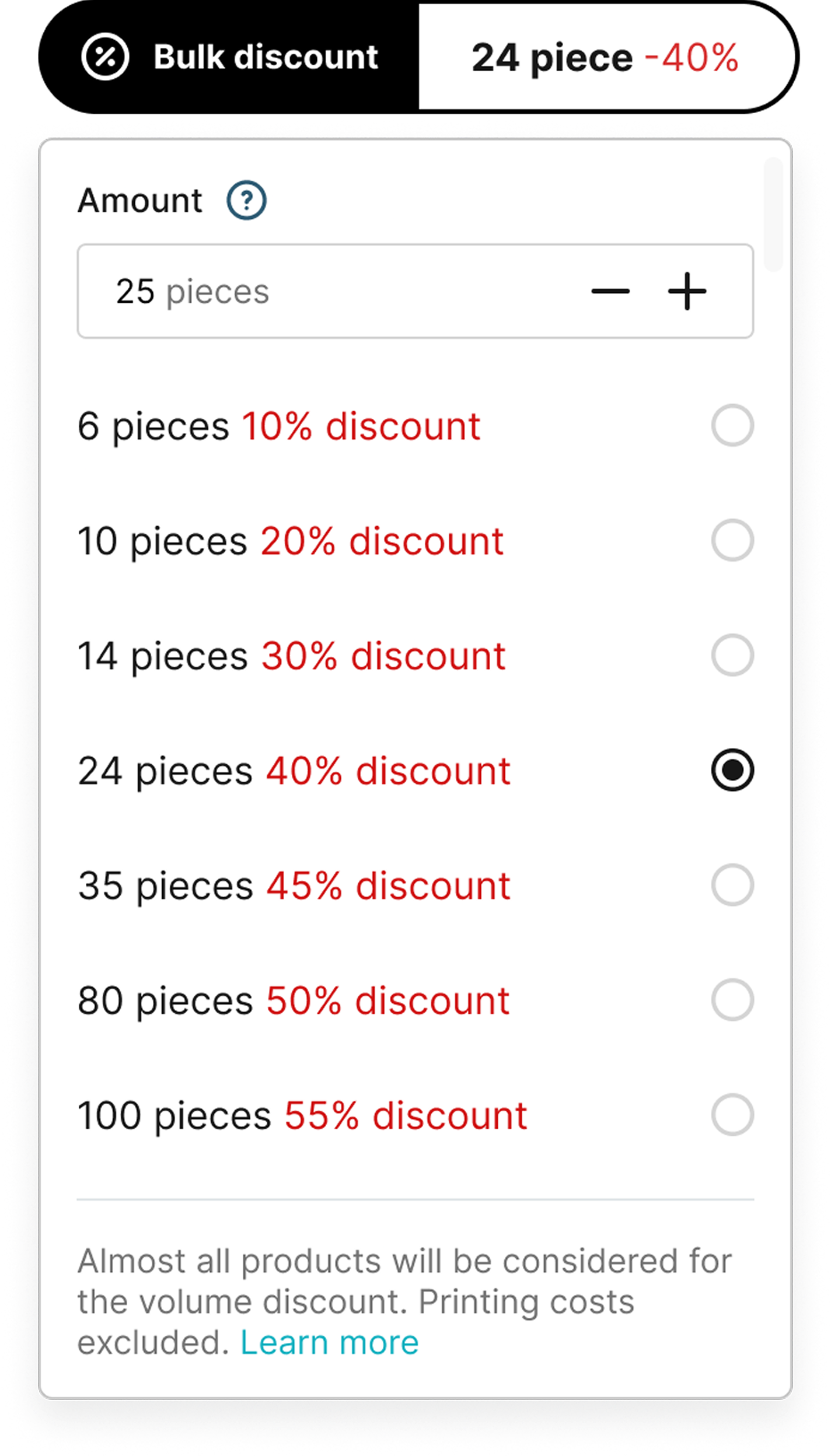
Discount percentages vary by product category and would eventually differ per product type. A unified tier display would show inaccurate percentages across the catalogue, replacing one trust problem with another.
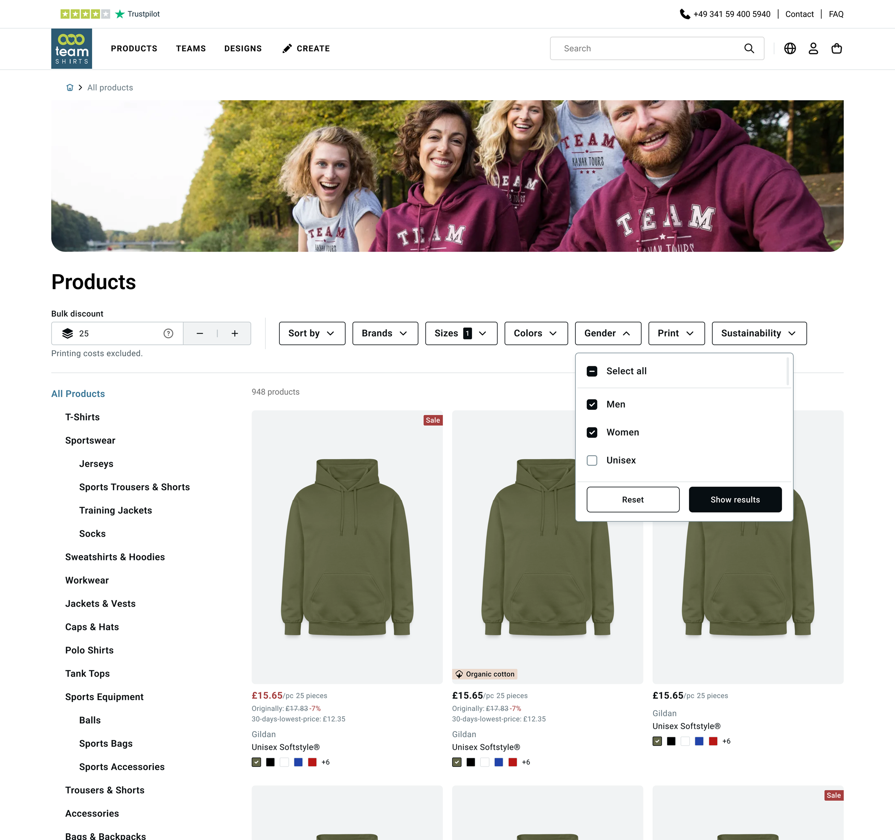
Approach 2 | Transparent bulk pricing with per-product accuracy (Approved)
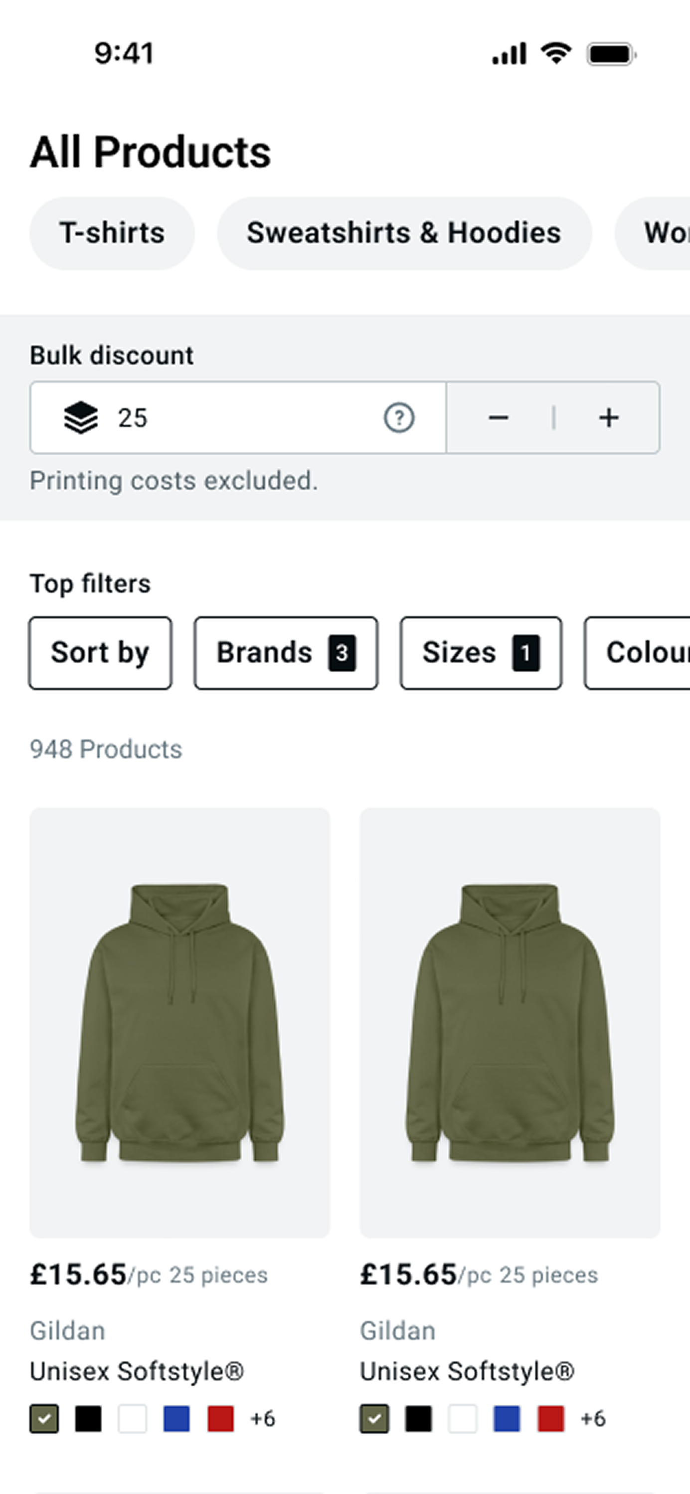
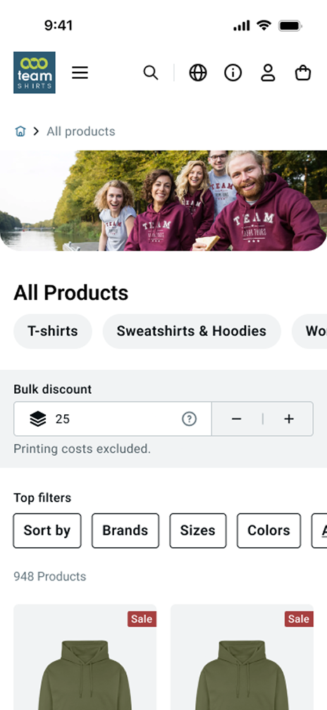
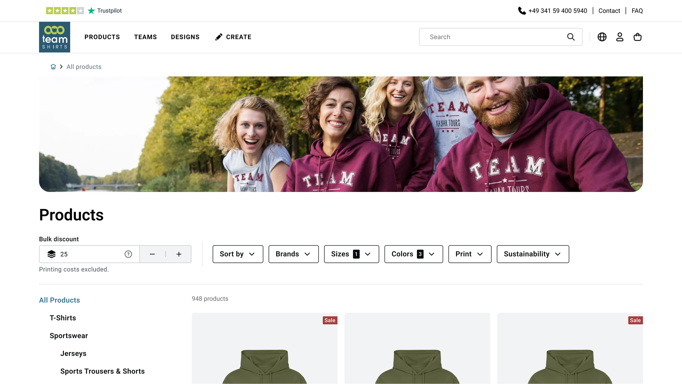
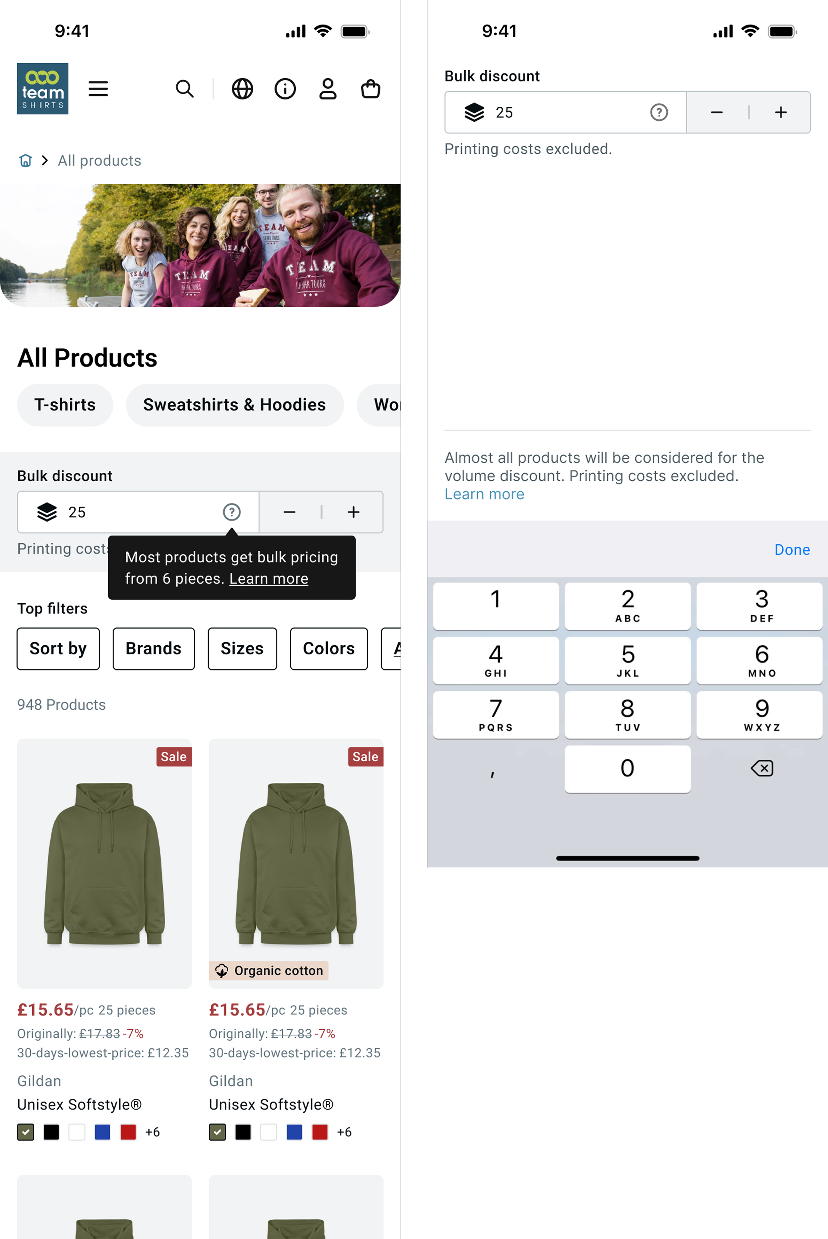
A prominent bulk discount component anchored at the top of the PLP (Mobil & Desktop), accessible input field, predefined quantity increments (25, 50, 100), and per-product price display that reflects the selected quantity accurately. Prices update per item based on real discount data, not a generalised tier.
Approach 2 | Transparent bulk pricing with per-product accuracy
Users who know their quantity can set it immediately and browse with accurate prices. Users who don’t know yet see the default 25, but now it’s:
- Clearly labelled as bulk pricing context, with a prominent component on top of the PLP.
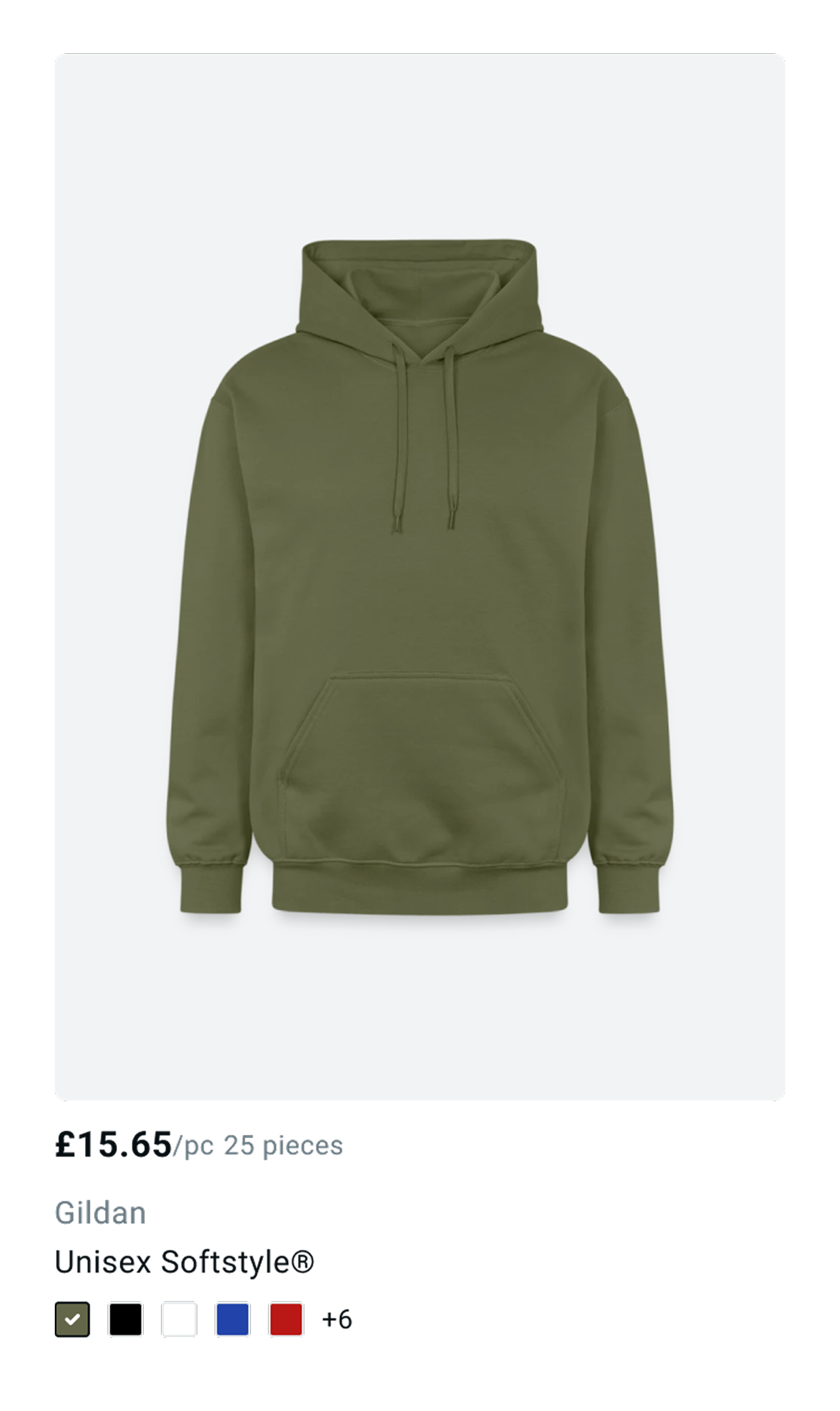
- Communicated on the PLP tiles too, “£15.65/pc 25 pieces”
What the redesign addressed
Pricing transparency
Bulk Context
Prominent above the fold
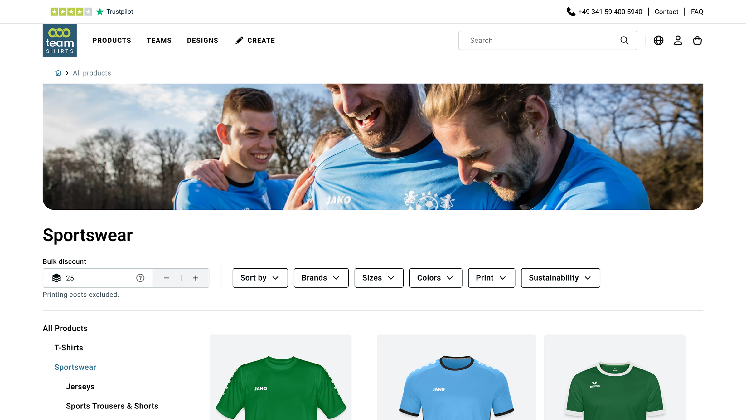
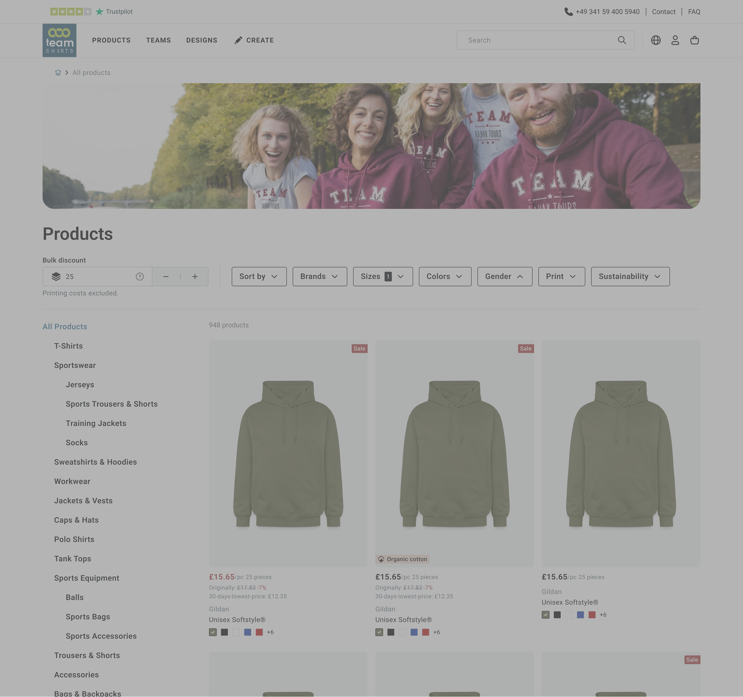
The bulk discount calculator is now the first thing users see on the PLP, especially on mobile, where it was previously easy to miss entirely.
UI Components
Product tiles
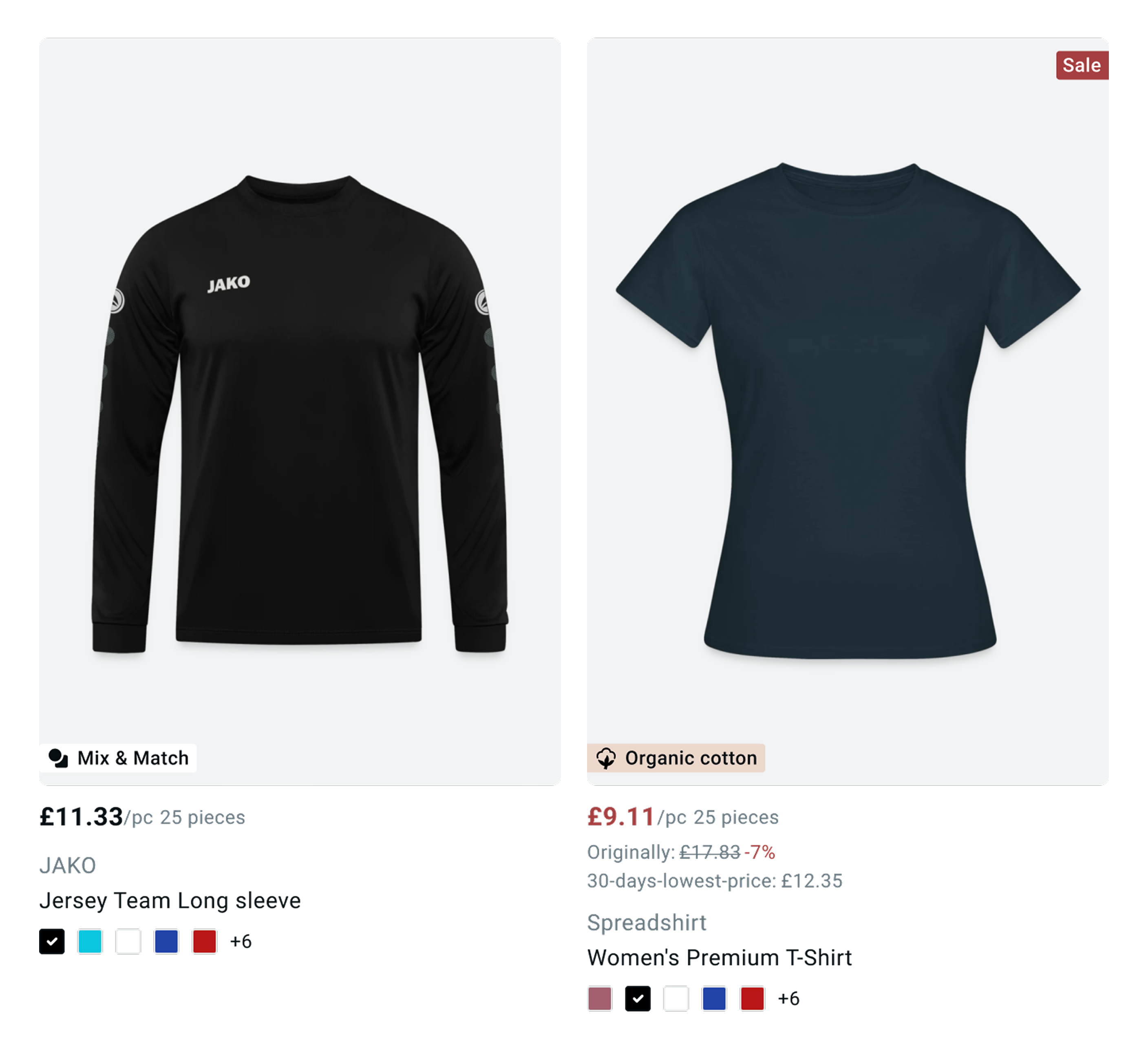
Price tied to quantity
“£15.65/pc · 25 pieces” displayed directly on every tile, connecting the per-item price to the quantity set at the top. No hidden assumptions.
Information hierarchy
Engagement
Category hero images
Team-in-action images introduced at the top of each product category, compensating for the absence of model imagery on tiles (an assortment constraint) and giving the page emotional context.
Page structure
Clear H1 and category navigation
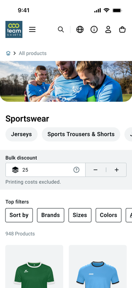
A clear H1 title anchors each page. Product categories are surfaced immediately below, stand-alone on desktop, prominent above filters on mobile, rather than buried inside the filter panel.
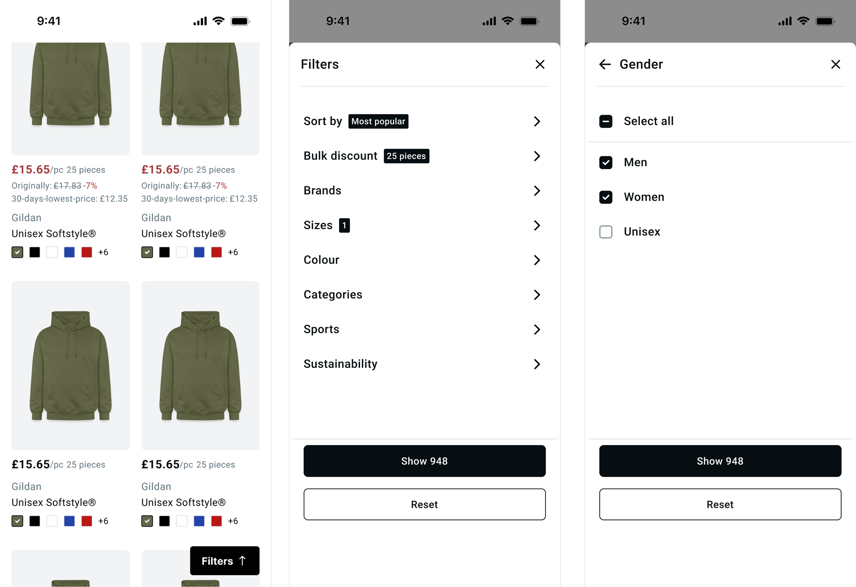
Filters
Significant improvements across both breakpoints
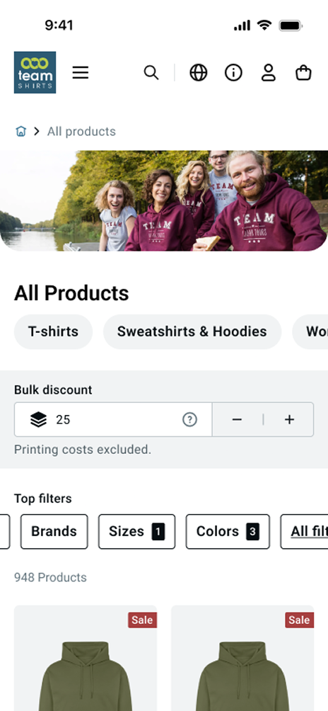
Filter UI rebuilt for desktop and mobile. Active filter count now shown per filter (“Colours 3”), giving users a clear summary of what’s applied without opening each panel.
Product tiles
Price clarity
Sale vs. bulk clearly separated
Sale prices and bulk discount prices now have distinct visual treatments — preventing users from misreading a volume price as a promotional deal.
Product properties
Organic cotton label with text
The icon-only organic cotton badge now includes a text label — making the attribute legible without relying on icon recognition alone.
Accessibility
Colour swatches always visible
Colour options are now permanently visible on tiles — no hover required. Contrast ratios meet accessibility standards throughout, fixing a major gap in the live version.
Before & After
Bulk pricing
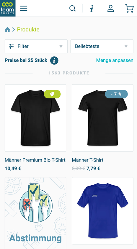
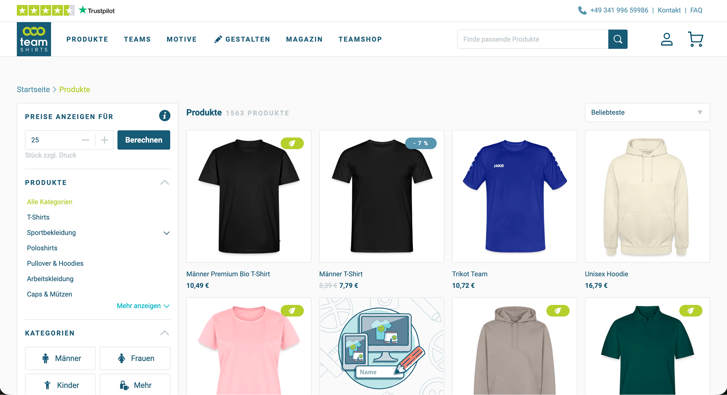
Prices displayed for 25 items by default with no prominent explanation. On mobile, the quantity context sits below the fold, most users miss it entirely.
Page structure
No hero image. Generic “Products” H1. Categories buried in a left-panel sidebar on desktop, hidden inside a single “Filter” dropdown on mobile.
Filters
Single undifferentiated “Filter” button on mobile with no indication of what’s active. No per-filter count. Users can’t tell what’s applied without opening the panel.
Product tiles
Bulk discounts and sale prices share the same visual treatment, a “-7%” badge that looks identical regardless of type. Organic label is icon-only. Colour swatches hidden behind hover.
Bulk pricing
Bulk discount calculator is the first element on the page. Price/item on every tile is explicitly tied to the selected quantity, no hidden assumptions, no checkout surprises.
Page structure
Team-in-action hero image sets emotional context. Clear H1 per category. Categories surfaced as stand-alone navigation, above filters on mobile, left panel on desktop.
Filters
Individual filter pills visible on both breakpoints. Active count shown per filter (“Colours 3”). Users see exactly what’s applied at a glance.
Product tiles
Sale and bulk prices visually distinct. Organic cotton label includes text alongside the icon. Colour swatches permanently visible, no hover required, with accessible contrast throughout.
Bulk discount input field
Filters
Loading state
Validation
The final direction was tested against the live version with users before stakeholder presentation. The key signal: users understood they were seeing per-item pricing for a specific quantity, without needing additional explanation.
Reflection
The most important skill this project required wasn’t visual, it was knowing when a constraint is fixed and designing around it rather than against it. The 25-item default wasn’t going to change. Spending more time advocating for it would have delayed a solution that users actually needed.
The simplified tier approach was cleaner on paper. Letting it go when the data accuracy problem became clear was the right call, a design that looks transparent but shows wrong numbers would have made the trust problem worse, not better.
Transparency isn’t about showing everythingIt’s about making sure what you show is accurate and clearly contextualised.